
With SIGGRAPH 2019 just around the corner we look at some of the FX animation in the Spider-Man: Into the Spider-Verse. On Thursday, 1 August 20193:45pm – 5:15pm in West Hall B, the film is one of this year’s featured production sessions. It will explore the art and innovation behind the creation of the Academy Award-winning Spider-Man: Into the Spider-Verse.
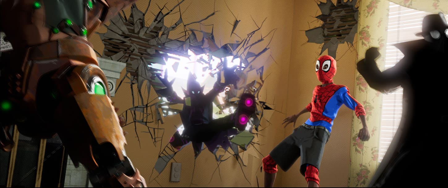
The filmmaking team behind the first-ever animated Spider-Man feature film took significant risks to develop an all-new visual style inspired by the graphic look of comic books. The hand of the artist is visible in every frame, including misalignments and bleeding colors, imperfections rarely seen in CG animation. The entire look of the film was driven by artists’ intentions, in which design and style was more important than accuracy or realism.
The presentation at SIGGRAPH will delve into all the new technology developed and the changes to both the pipeline and workflow required to accommodate working in this new visual style. Every department at Sony Pictures Imageworks (SPI) was asked to reconsider what it means to make an animated feature in the spirit of this revolutionary comic book style and to bring something new to the look of the film. Various new techniques were developed including the rigging and animating of facial line work, 2D hand-drawn effects and stylized rendering.
The effects work involved a team of artists at SPI, in particular, Pav Grochola (FX Supervisor) , and fx visual effects artists Ian Farnsworth and Viktor Lundqvist, who all contributed to this story. Here we recount the work that went into the stylised design and FX animation of the film as a prelude to their SIGGRAPH presentation in LA.
At SIGGRAPH Grochola will present more of this work along with the films VFX Supervisor Danny Dimian, the Animation Supervisor, Joshua Beveridge, Look Development Supervisor: Bret St. Clair, and CG Supervisor, Ben Hendricks.

Introduction
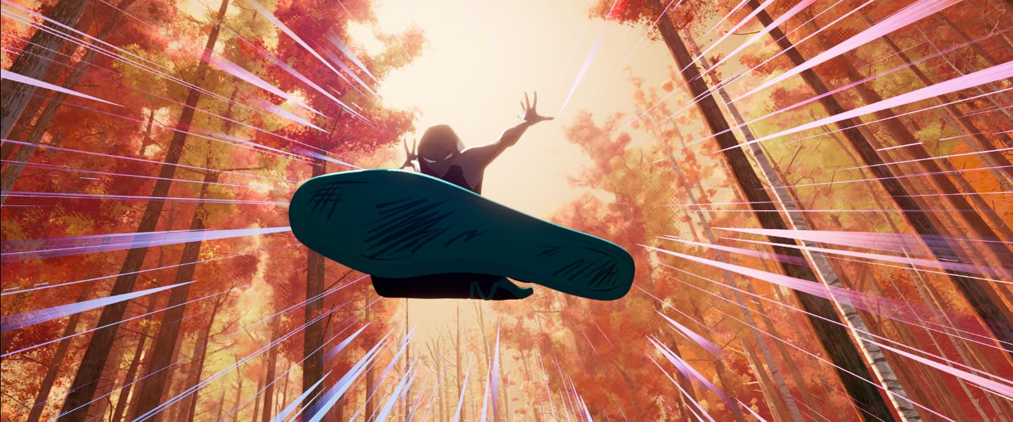
Stylized realism has become the status quo for rendering animated films. The tools and algorithms made to produce photorealistic results in live action films are fundamentally the same ones used in animation. Lighting algorithms along with smoke, fire and water fluid dynamics all aim to emulate reality. Spider-Verse however, was clearly seeking a different direction. Instead of realism, its goal was a highly designed comic book language. It was critical that the effects looked artistically designed to fit within the overall comic book aesthetic.
For the effects team, this raised some serious challenges. As a department, they could not count on simulation algorithms alone, like the team had been able to on previous shows. Furthermore, photorealistic simulations simply would not fit the language of the film that the directors Bob Persichetti, Peter Ramsey and Rodney Rothman wanted. For SPI, design, instead of algorithmically accurate simulations became the primary focus. By extensively referencing 2D effects animation, the team pushed their FX department into making deliberate and visually dramatic artistic choices. The results were both innovative and hugely popular with audiences, who embraced the film and its original aesthetic.
Stylisation and Motion Blur
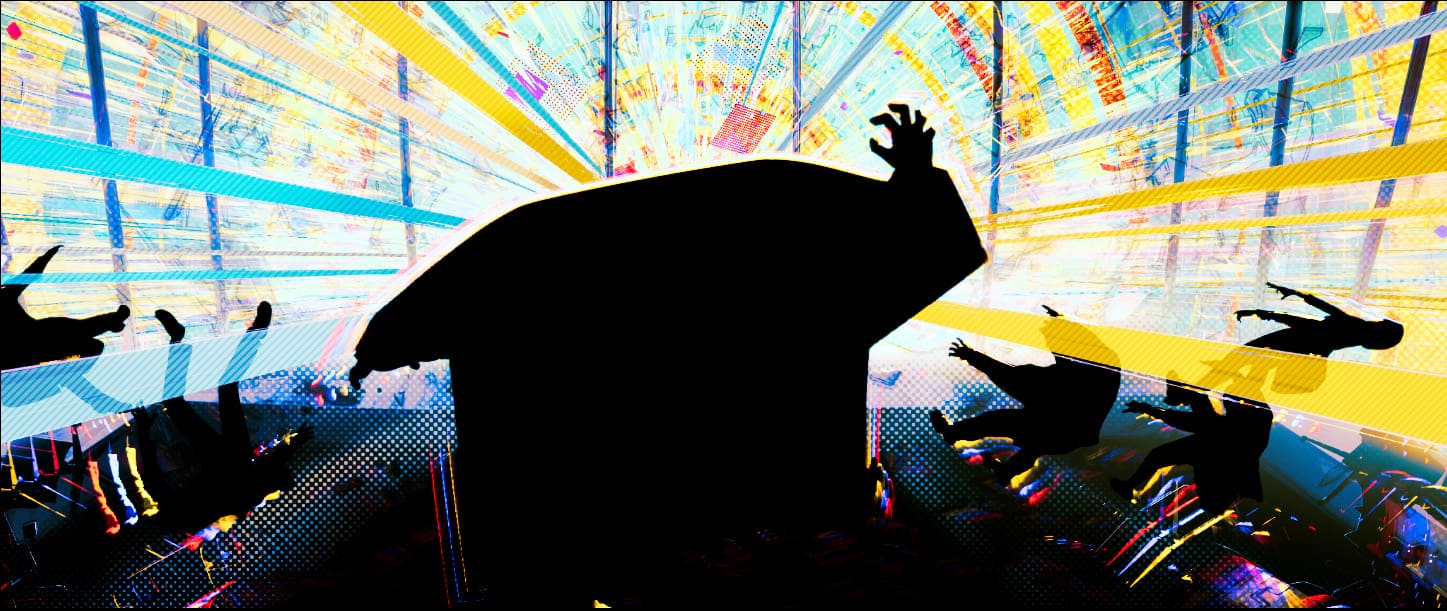
SPI had to develop a host of techniques and tools to help them embrace their aesthetic stylization challenge. The effects had to be very carefully composed in screen to ensure they hit the right look. For example, spark simulations were not motion-blurred particles, instead, they were carefully created geometric shapes, often animated on 2s. The broken geometry for rigid body dynamics was equally stylized by simplifying shapes and also stepping the output of simulation on 2s.
The show’s stylistic choice to not use motion blur was both liberating and problematic. Effects often creates fast moving objects that would strobe without some type of streaking. The team invented their own stylized version of motion blur. In fast moving sequences, streaky geometry often helped smooth the motion of fast moving objects or create more visual impact in a scene.
For example, SPI used this streaks technique very effectively when Miles and Peter are being dragged through the city by the train. These effects gave the scene more punch and also helped reinforce the comic-book style of the film
Volumetrics
The biggest departure from the typical feature workflow however, was in how the team approached volumetric effects such as explosions. “We had initially tried doing some smoke or explosions using some simple particles and spheres, and then having them erode or evolve in interesting ways using solvers and shaders. While the results looked interesting, they never really hit the mark, and definitely never felt stylized or hand-drawn enough” commented Grochola. “They always had this element of ‘CG’ to them, and while we feel given enough time we could potentially push it a lot farther”. The team decided to look for a 2D FX artist to help us and enlisted the help of Alex Redfish.
Alex Redfish, Vimeo demos exemplified a style that would fit the desired language of the film. He provided SPI with a small re-usable library of 2D FX, starting with an explosion. “We had him provide as many layers as he could for us, so we could mix and match as needed, and also place things in depth for the 3D stereo side of things, too,” details Farnsworth. “He was able to provide us with a few explosion variations with multiple layers each, gun muzzle flash shapes, spark hit shapes, smoke, steam and flame elements.”
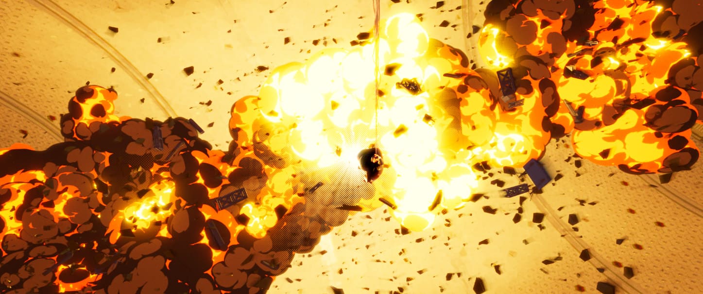
Being able to view the animations in real-time was very important to the production. They created sprite sheets for all the animations that they were going to use. In Houdini a setup was created that would allow artists to select images from the library and then view the animation in real-time in the viewport.”This is a common technique used in games, where instead of loading a specific frame of animation for every card, you only have to load a single image that has all the frames and you modulate the UVs to switch frames” commented Farnsworth.
Glitching, Kirby dots and Multiverse
If the visual style of Spider-Verse can be described as unconventional, so can the unorthodox effects we created, such as the Glitching, Kirby dots, and the Multiverse.
The film’s final battle sequence fills the volume of space with ‘Kirby dots’ – inspired by the Marvel artist Jack Kirby. The simple dot shapes made composition and timing essential, Houdini was again utilised to fill up a volume of space with ‘Kirby dots’.
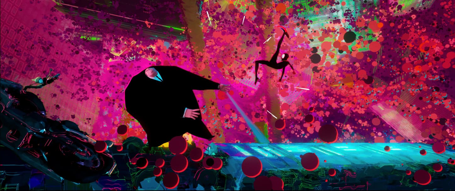
The glitching effect splits the screen into cell patterns, assigning a different camera to each cell. One cell could be a zoomed in version of the character’s eyes, the next one could be the character’s face seen from a 90 degree angle shift. This created a fractured look of the character or environment.

Conclusion
In Spider-verse the effects department was challenged to move away from a simulation driven workflow to a design driven one. Creating effects that fit within the beautiful visual language of Spiderverse has expanded our understanding of what effects can achieve.

Both fxphd and fxguide will be at SIGGRAPH in LA late July. As always we’d love to meet up with members and please if you see us – say hello. We are always keen to connect with members and SIGGRAPH is a great opportunity to do this.