Many of fxphd’s students are people who have come to VFX from a different field. Prof. Mikey Rogers is also one of those – he had a career in it before launching into visual effects and working at companies such as Buck, Rhythm & Hues, The Mill, Imaginary Forces, Digital Domain and Pixomondo. Now a CG artist, Rogers is teaching our MAR201: Intermediate MARI Techniques course. Below he explains his love of MARI and provides some tips about the visual effects industry.
Rogers worked in IT before transitioning to VFX – here’s his story about how he got into the industry…
I love this question, because it wasn’t just my life as an IT Professional that got me to where I am today. That’s only half the story. The other half was my passion for theatre and acting. Cue the dream sequence / time travel effect — it all began when I was but a young lad in grade school. Up until about the 3rd grade, I sang in the choir of the Christmas plays put on by my school. Choir was certainly fun and challenging in and of itself (yeah, even for a 3rd grader), but I yearned for something more! I wanted to be like the untouchable 4th and 5th graders up on stage, where the action and attention lived.
So I began trying out for plays, landing parts and became enthralled with entertaining. I loved transposing myself into someone completely different from me and getting the audience to believe my character. I continued to act, participate in competitions and even did a musical all the way through high school. All the while, my dream job to star in a hollywood film as I love, love, love movies.
Above: check out Mikey Rogers’ demo reel. You can see more of his work at http://mikeyrogers.com.
It was here where my infatuation with computers took hold — I’d always loved technology and just had to have the latest gear, but I finally realized that I could make a living working in the tech industry. So in my Junior year in high school, I applied to the biggest IT company in El Paso, TX and worked there off and on for several years. Since then, I worked for a spattering of different IT-centric companies and even had clients of my own, almost forgetting my initial passion of the arts, but after a while I grew increasingly anxious and set my sights on visual effects.
This career path always seemed like the perfect crossroads for me. A delicate mix of the arts stirred in with technology. It’s me to a T. I get to play with the cool tech that always fascinated me while getting to entertain people with the films and advertisements I’ve made. What a life!
On things to look out for as a CG artist…
Does your family ever give you crap for having an endless photo library of ‘things’ and not of people? I find myself extremely interested in my surroundings and usually have my camera pointed at bridges, buildings and boulders. My iPhone is my best tool because it allows me to stop, mid-conversation with a friend, back up a few steps and snap a photo of the most random thing. As a CG Artist, I’m in constant observation of my surroundings and find a need to document everything. It doesn’t even need to be a photo for texture use directly. Just something that captures a moment. A striking sunset. A gloomy alley way. A foggy beach. After all, it’s the environment in its entirety that affects how things are ‘textured’ or how they look.
Which brings me to another thing — notice how an environment changes based on different weather and lighting conditions. If you pay close attention to these things, you’ll start to notice the natural beauty and contrast in our surroundings. For instance, Google Image search ‘new mexico sunrise’. Look at the colors in the sky (light) versus the colors on the ground (shadow). You’ll likely see really saturated oranges and yellows in the sky with sappy blues and purples along the hills. Now take a look at the color wheel. Notice a correlation between those colors? They’re complimentary! No wonder southwest sunrise and sunsets are so stunning! If you take the same setting at mid-day, you may not be as interested in the subject matter as things tend to get flattened out. So time of day plays a huge role in how certain environments look and feel.
Above: Strife – Rook teaser from S2, which Rogers contributed to as the lead look development and lighting artist for Imaginary Forces.
Now this all may sound really basic, but it’s these fundamentals that I sometimes see missing in the work of others. If you’re lighting a scene, give it some contrast and don’t be afraid to saturate your shadows. Make it stylized (if it’s called for) and make it your own. When you’re texture painting, do the same thing. Make sure your model has visual interest within itself so that it keeps the interest of whoever gets to marvel at your creation.
So the next time your family scoffs at your series of bridge photos, take a step back (and a breath) and point out all the cool features found in your shot. Maybe they’ll jump in on the conversation and reveal to you their closely guarded collection of rash photos…
On working in film, TV and in commercials…
Well, lets start with film. Film is challenging for a couple of reasons. Features are usually held to a higher standard (depending on the feature, of course) in terms of quality of work that’s expected from the visual effects department. To counteract that, you generally get more time to finesse your assets to have them meet that standard. So while that could be a challenge in itself, there comes an even greater challenge with film — the endless months of scrutiny and change. After spending tireless hours on a set of assets, the end result is the culmination of the input from ten other people (from supervisors to directors and producers). So your asset may not really feel like your asset in the end, despite being the one to finesse it and make it look photo real and of film quality.
Now that’s not to say that there’s zero scrutiny in the advertising world, but from my experience you get to have a little more pull and creative control when it comes to the decision making on your work. Of course, the client always has the final say (ALWAYS), but the end result here feels a little more personal. Now the downside, of course, are the shorter deadlines, so the level of quality may not always reach its fullest potential (again, depending on the project). I’ve personally had more of an affinity toward advertising work just because it’s a little bit more design-focused, which leads to more visually pleasing projects. Plus, it makes my demo reel really fun to edit to.
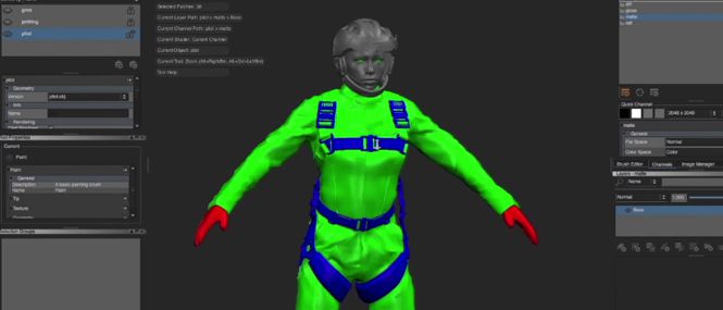
Rogers was an early adopter of MARI. Here’s how he started using the software…
As luck would have it, I used MARI on one of the first commercials I had worked on as a CG Artist. My personal mentor at the time, Scott Metzger, was able to snag a prerelease build of MARI before it even hit version 1.0. It’s funny, really. Myself and two of my close friends, Matthew Radford (an FX Artist at Naughty Dog) and Patrick Ross (Lighter at Framestore), all were fortunate enough to have landed staff jobs at Method Studios straight out of college. At the time, the two of them were extremely excited to use MARI as it was ‘the next big thing in texture painting’. For whatever reason, I just wasn’t buying. I was stuck up and wondered why people would want to paint in 3D. After all, I never found much enjoyment out of using Mudbox or BodyPaint 3D.
So I was this diehard Photoshop guy, claiming that 2D could do it all. Then I used MARI, against my will. And it was amazing. Even despite its extreme sluggishness in its infancy (I’m allowed to say that, right? I mean it was beta!), I knew this product was something extremely unique and would change the way I worked for years to come. I spent hours texture painting my first MARI asset — this fire hydrant — that would take up like two pixels of screen space in this Lexus advertisement. I was able to send a lot of other assets through the software for that project, which can still be seen on my reel!
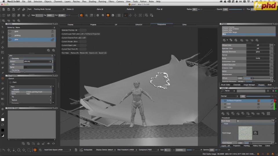
I’ve been a huge advocate of the software since, using it at studios like Digital Domain, Pixomondo, Buck and The Mill. Some of the coolest features I’ve seen come to fruition are the tri-planar tool, environment maps and of course, a full-fledged layering system. I’m currently beta testing the next version of MARI and I have to say, there are some earth-shattering, MUCH desired features coming down the pipe! It’s okay. You may hold your breath.
Tri-planar is amazing for getting a quick base to cover your entire model in one fell swoop. MARI is also great to setup your HDRs and project onto proxy geometry for pixel accurate environments for use in lighting. The often ignored pan and scale lock options for the paint-through tool are also extremely useful. It’s a genius addition and really helps to get in close to line up your projection perfectly before zooming back out and going to town!
His tips for great MARI work out there…
Well, I may be a little biased because I learned a lot of what I know about V-Ray directly from this guy, but Scott Metzger really never ceases to impress me. He’s always super passionate about the art and tech in lighting and really pushes MARI to become the best painting package on the market. If you want to be in the know when it comes to the latest and greatest in the Lighting and Look Development world, pay really close attention to what he’s doing. This is one of his latest environment tests using MARI, LightBrush — which I’m covering in one of my chapters for my course (pardon the shameless plug) — and V-Ray. Check it out below:
On being part of fxphd and what to expect from the Intermediate MARI course…
I first learned about fxphd through the fxguide site and subsequent podcasts. It was immediately apparent to me that these guys were extremely passionate about the industry and obvious that their training was just as robust.
I’ve been fortunate enough to work with a lot of talented artists at 12 different studios over the past 3 years. My background is extremely Look Development-centric, with a heavy emphasis on working in commercials. I rarely ever just do texture painting (except for the few features that I worked on) and because of that, I wanted to do something a little different in my course and help texture artists learn how the Look Development and Lighting process works. So we’ll spend a lot of time in both MARI and V-Ray to really fine-tune their maps.
I feel that it will even benefit the Texture Artist who never anticipates doing Look Development on their own so that they know what their maps are supposed to look like and how they’re used in the shader. To keep the student’s interest, I wanted to make this a project-centric lesson (taking one or two hero assets from start to finish) so that they can get a feeling on what it’s like to work on a film-quality model and what it takes to take such an asset to completion. It’s the perfect way to learn everything there is to know about MARI and the texture painting / look development process.
Find out more about Mike Rogers’ MAR201: Intermediate MARI Techniques course at fxphd.